 3 Terms
Home > Terms > English, UK (UE) > Gap logo
Gap logo
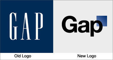
Gap has used the same logo for over 20 years, instantly recognisable with its stretched, white letters against a navy blue background. Yet the company recently released a new logo, created in collaboration with the customer community, to widespread indignation. It has been called a “Microsoft Word” creation and a “prototypical brand panic move”. Gap is already rethinking the change.
This is auto-generated content. You can help to improve it.
0
0
Improve it
- Part of Speech: noun
- Synonym(s):
- Blossary:
- Industry/Domain: Apparel
- Category: Coats & jackets
- Company: Gap
- Product:
- Acronym-Abbreviation:
Other Languages:
Member comments
Terms in the News
Featured Terms
Industry/Domain: Zoology Category: Zoological terms
phylum placozoa
Macroscopic, flattened marine animals, composed of ventral and dorsal epithelial layers enclosing ...
Industry/Domain: Zoology Category: Zoological terms
phylum cnidaria
Cnidarians. Hydras, hydroids, jellyfish, sea anemones, and corals. Free-swimming or sessile, with ...
Industry/Domain: Accounting Category: Auditing
share a term with millions
Share a term with millions of users around the world and increase your online visibility.Share a ...
oak
Genus native to the Northern Hemisphere with spirally arranged leaves, catkins for flowers and ...

Everest
The last but not least mount Everest. The Earth's highest mountain, with a peak at 8,848 metres ...
Industry/Domain: Plants Category: General plants
aglaonema
Genus of about 20 species of usually rhizomatous, evergreen perennials from tropical forest in Asia. ...

Industry/Domain: Science Category: General science
Robojelly
Robojelly is a hydrogen-powered robot desgined in the United States that moves through the water ...
Industry/Domain: People Category: Entrepreneurs
Ferdinand Porsche
Ferdinand Porsche (3 September 1875 – 30 January 1951) was an Austrian-German automotive engineer ...
Industry/Domain: Broadcasting & receiving Category: News
Marzieh Afkham
Marzieh Afkham, who is the country’s first foreign ministry spokeswoman, will head a mission in east ...
Industry/Domain: Accounting Category: Auditing
define1
Share a term with millions of users around the world and increase your online visibility.Share a ...
Contributor
Featured blossaries
farooq92
0
Terms
47
Blossaries
3
Followers
List of highest grossing films
Category: Engineering 1 3 Terms
3 Terms
Browers Terms By Category
- Economics(2399)
- International economics(1257)
- International trade(355)
- Forex(77)
- Ecommerce(21)
- Economic standardization(2)
Economy(4111) Terms
- General furniture(461)
- Oriental rugs(322)
- Bedding(69)
- Curtains(52)
- Carpets(40)
- Chinese antique furniture(36)
Home furnishings(1084) Terms
- Bread(293)
- Cookies(91)
- Pastries(81)
- Cakes(69)
Baked goods(534) Terms
- Mapping science(4042)
- Soil science(1654)
- Physical oceanography(1561)
- Geology(1407)
- Seismology(488)
- Remote sensing(446)
Earth science(10026) Terms
- General accounting(956)
- Auditing(714)
- Tax(314)
- Payroll(302)
- Property(1)